For our final phase, the Physicalization, we wanted to use the input from the previous phases and build a prototype which would embody both the visual and also the haptical aspects.
In the Haptification phase we tried to realize our idea by having an alternative version of a Christmas tree. Since space on each ring would be limited and we wanted to have a Prototype which would be handy enough to bring it everywhere we distanced ourselves from the “tree-structure” and decided we wanted to a wearable Prototype. The skin on the wrist is very sensitive towards haptical sensations so we came up with the idea to have a Bracelet as final Prototype.
DESIGN PROCESS
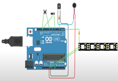
For the Bracelet Design we had defined the requirements, that it should support shape-shifting, contain lights and would give haptical feedback by vibrating.
Behind the Bracelet we wanted to place led-lights which would illuminate a specific-colored light for each emotion and also integrate a vibration motor with matching vibration pattern.
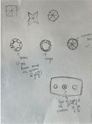
In the beginning, we focused on representing each emotion by a different shape and experimented with the shapes.

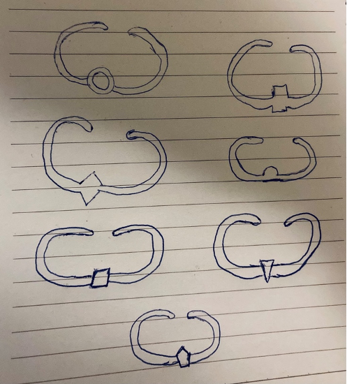
Nevertheless, we had to find different approaches, because we had to realize that it would be very time-consuming and material-intensive to print seven different Bracelets (one for each emotion).
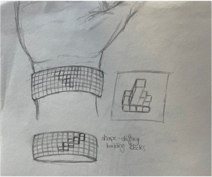
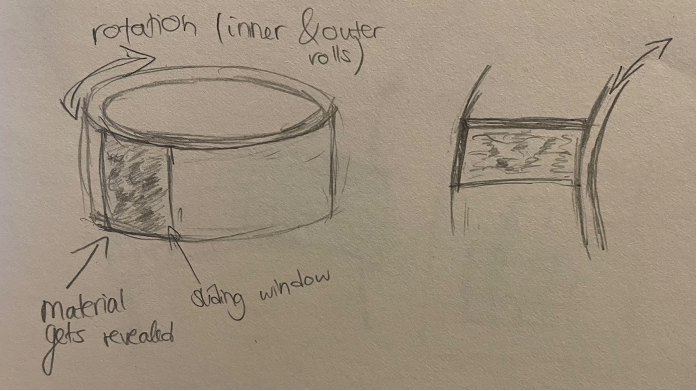
Within our further research one specific article inspired our next Designs. It was about a shape-shifting interface, invented by MIT, which could offer a new form of interaction by moving building blocks (https://tangible.media.mit.edu/project/inform/). We tried to integrate the shape-shifting building blocks into the Bracelet and also modified the shapes of the building blocks. Another idea was, to have two Bracelets, where one would have some kind of “sliding window” and would be able to rotate over the second Bracelet in order to reveal different materials. In this approach, again we had the problem that it would be difficult to 3D-print it and we couldn’t find a technology which would enable us to actually make the building blocks or the sliding window movable. So we rejected this idea as well.

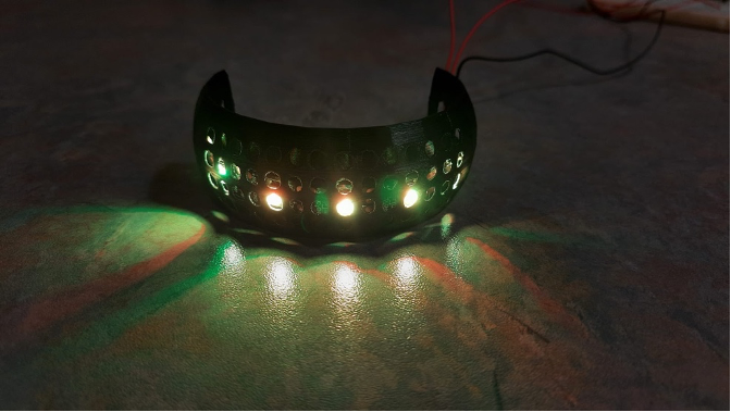
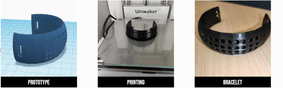
Our final idea was to cut holes into the Bracelet, where the number of holes would show the intensity of the emotion and we wanted to have LED-lights shine through the holes. In the Prototype sketch we had also thought of showing each emotion by a different shape, but again we had to simplify it in order to 3D-print it.

The final prototype was a half-shaped bracelet in order to easily place the vibrator and the led lights in it. The rectangular holes at the edges were complemented with an arm band for wrist adjustments.
MAPPING EMOTIONS TO COLORS AND VIBRATION PATTERN
The aim in the next step was to figure out how to match different vibration patterns and colors to an emotion. For e.g: the color red was matched to the emotion – anger. Vibration patterns were categorized based on the haptic level of intensity of the pattern. E.g: A softer pattern symbolizes sadness and a harsher one – anger. The final mapping was done based on a paper proposing vibration patterns for emotions.

USER RESEARCH METHODS
We conducted an unmoderated and moderated test with 10 test participants. The results revealed that the moderated test approach was the best suited for our project to capture better qualitative results of haptic feedback.
| Fear | Anger | Surprise | Sadness | |
| Vibration Pattern #1 | 1 | 3 | 6 | 0 |
| Vibration Pattern #2 | 5 | 5 | 0 | 0 |
| Vibration Pattern #3 | 0 | 0 | 3 | 7 |
| Vibration Pattern #4 | 6 | 3 | 1 | 0 |
The results supported our initial mapping based on the mentioned scientific paper and also caused us to do some refinements in order to make Fear and Anger better distinguishable and make it more fitting. In the end, this was our working Prototype.